Document Redesign
This section showcases my ability to rework existing documents for improved clarity, usability, and visual cohesion. Whether simplifying technical guides, creating consistent handbook layouts, or elevating the professionalism of certificates, each redesign reflects my attention to typography, alignment, accessibility, and brand consistency. I combine clear visual hierarchy with purposeful design choices to make information not just more attractive, but more effective.
Desk Lead Handbook
For the handbook redesign, I focused on maintaining brand consistency by using official colors and integrating color theory for visual balance. I also incorporated the new logo to create a more cohesive and streamlined look.


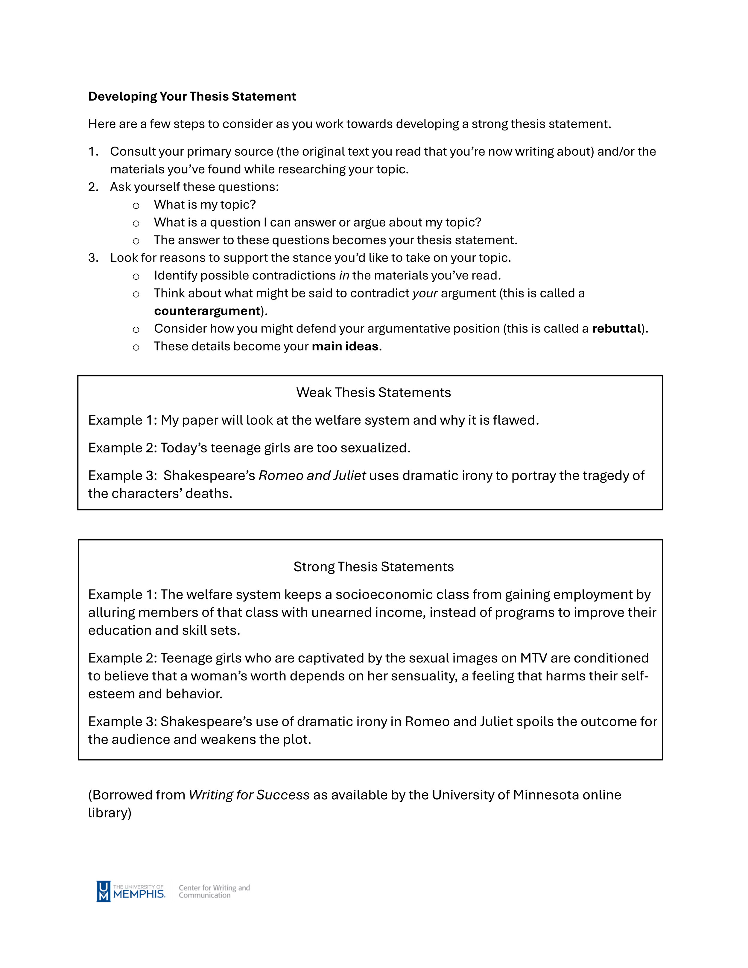
For text-heavy sections of the handbook, I applied the foundations of typography to improve readability and flow. By grouping blocks of text into clear categories and using visual hierarchy, I created natural guideposts and breakpoints to help the reader navigate the information more easily.
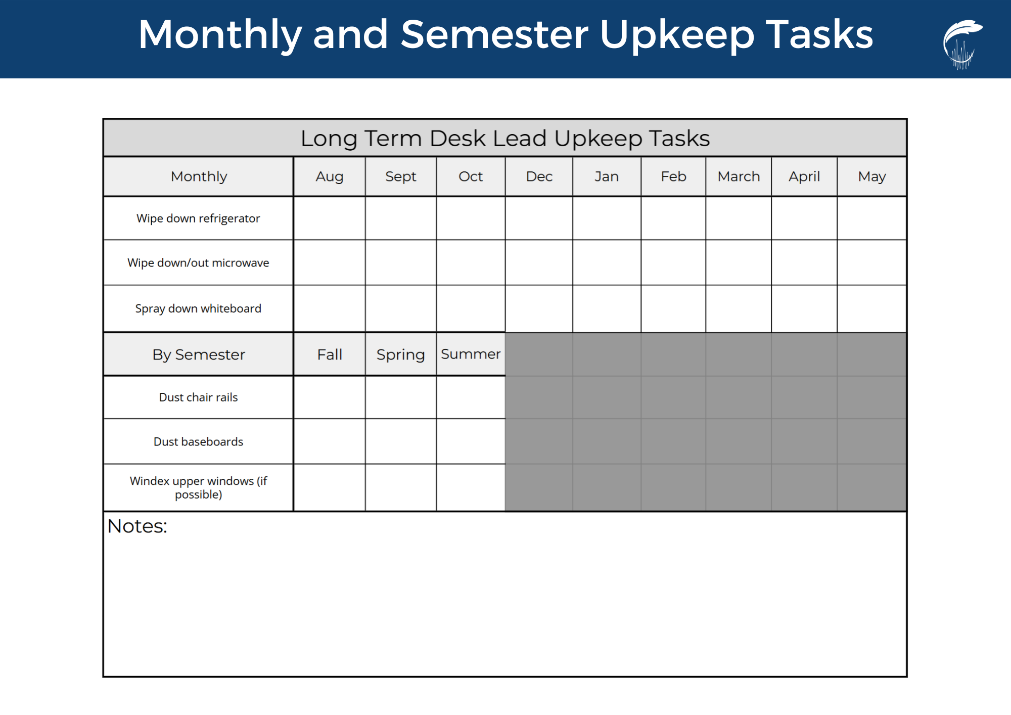
For this task management system, I reduced visual clutter by using a grid-based layout, making the checklist easier to follow and use. I also optimized the white space by adding a notes section for additional flexibility.
Decluttered layout and added intuitive visual cues for clarity. Optimized step-by-step flow for non-technical users while maintaining brand consistency.


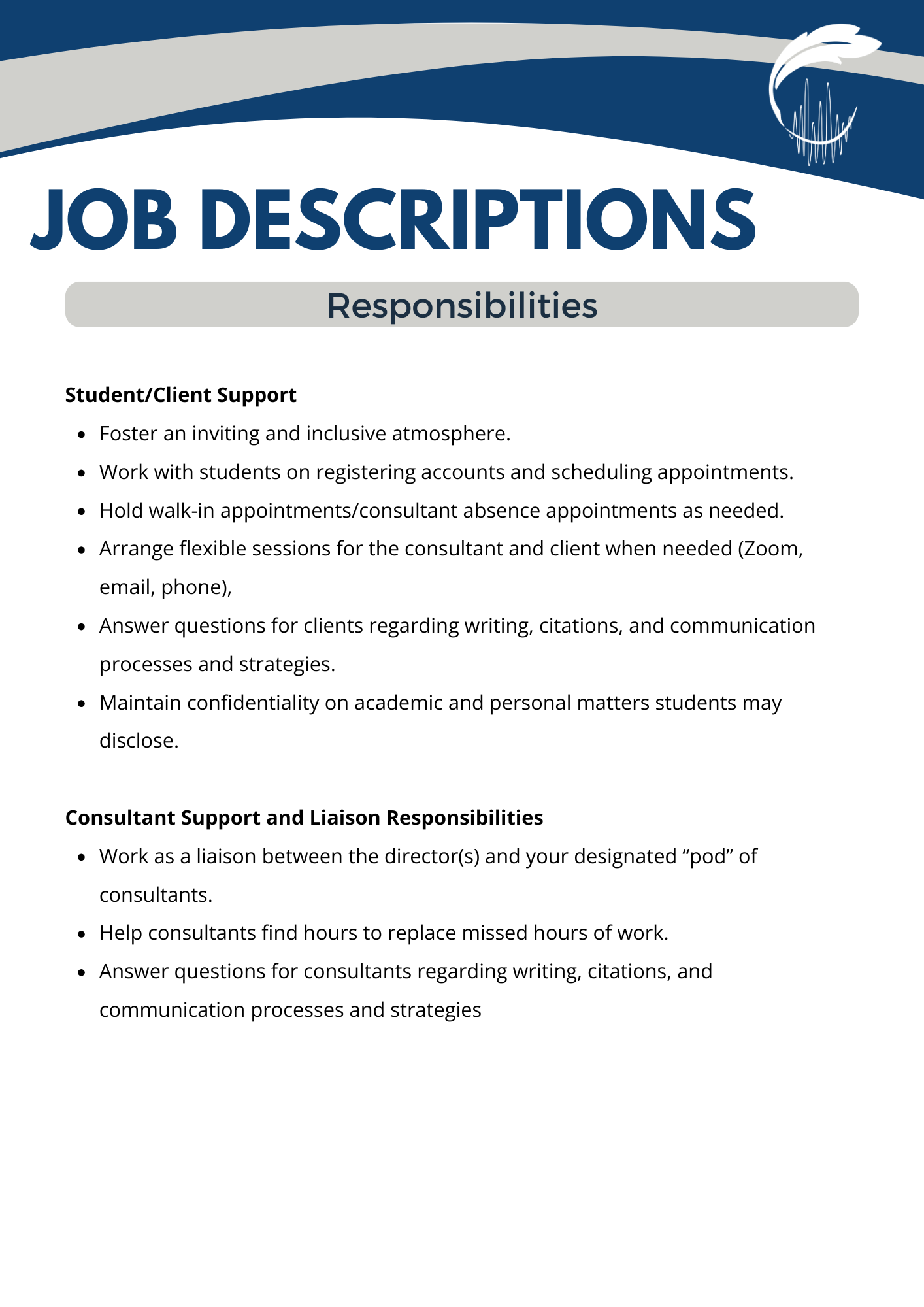
Student Guides
Redesigned student guides into clear, accessible materials with a flexible header system (“let’s learn,” “example of”) to ensure brand consistency and a student-friendly experience across all handouts.


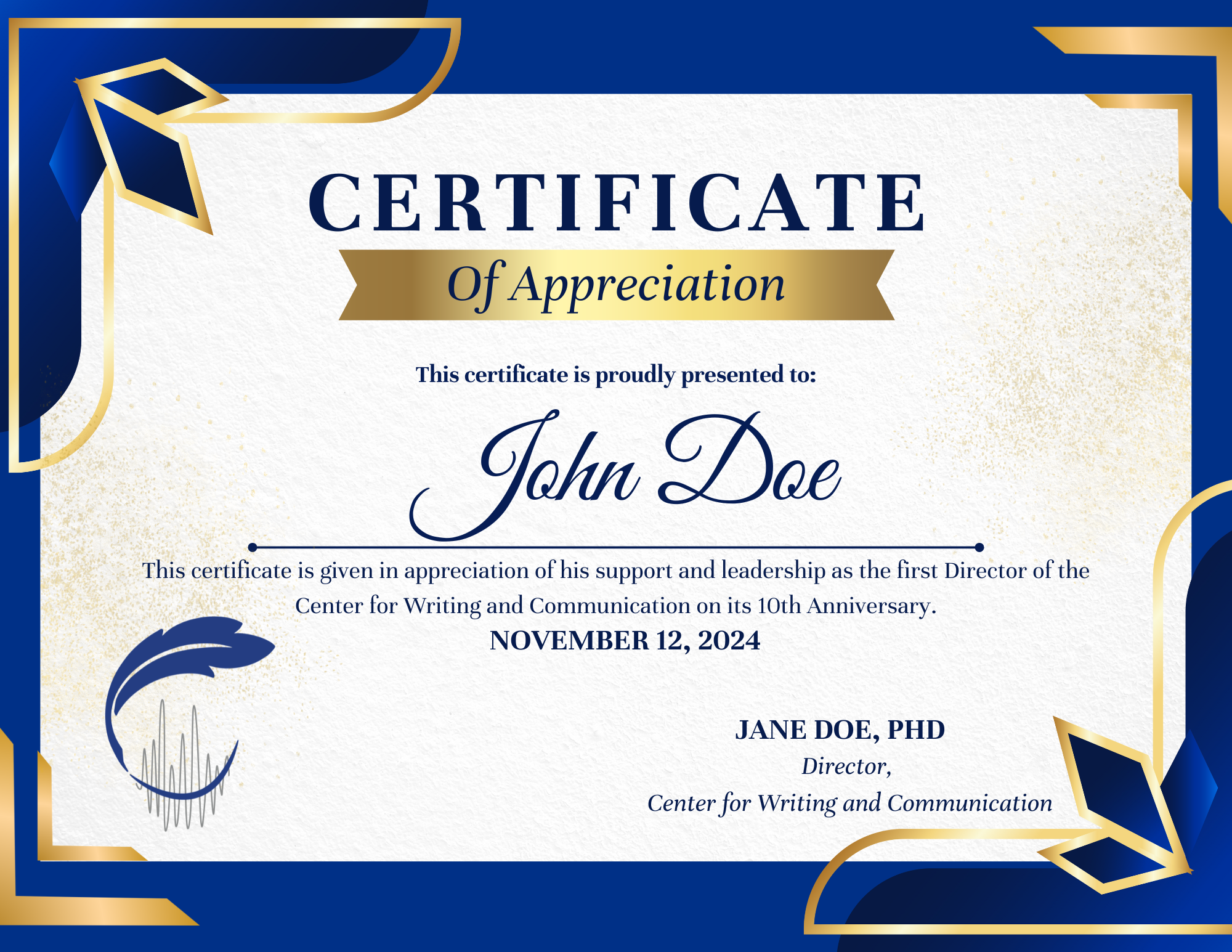
Certificate of Appreciation
Redesigned certificate for improved clarity, symmetry, and elegance using a refined color palette and simplified layout.